A question often asked in the context of upscalers and retro gaming is, what did the artist intend? I’m not a great artist, but I have made some games of my own and have done the pixel art for them; even if it is just a step above “Programmer Art”. So I decided to take a look at my largest game project in terms of art, Space Ava 201, and tell you what I think about different ways to play it, and my own opinions. On my own blog I wrote a post about how I made graphics; I guess this is a follow-up about looking at them.
The universal disclaimer
Basically, don’t worry about the author’s intent. Play games how you like them. And now that I’ve defeated the enitre point of this blog post, let’s continue.
Some test screens
I decided to try to pick out some screens that might best show different elements. We’ll start with pixel-perfect screenshots.

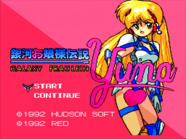
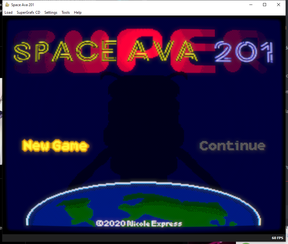
First off, the title screen. This is one that I think really doesn’t look great on a simple 1:1 pixel scaling; the shadow’s arms look a bit fiddly. However, the text at the bottom of the screen (not in an overscan-safe region!) is crisp and pixel-perfect. So there are definitely tradeoffs.
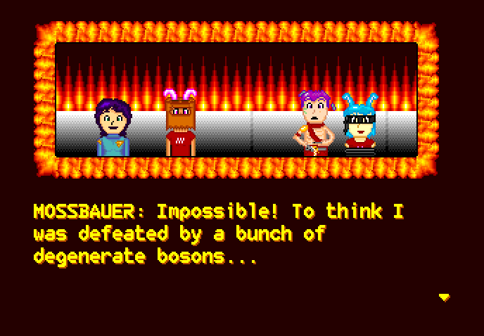
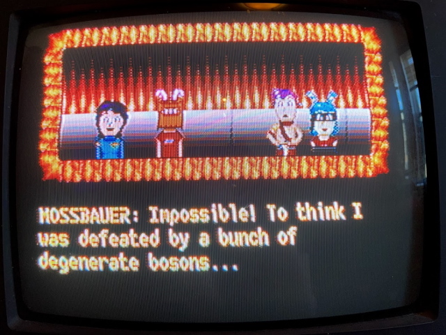
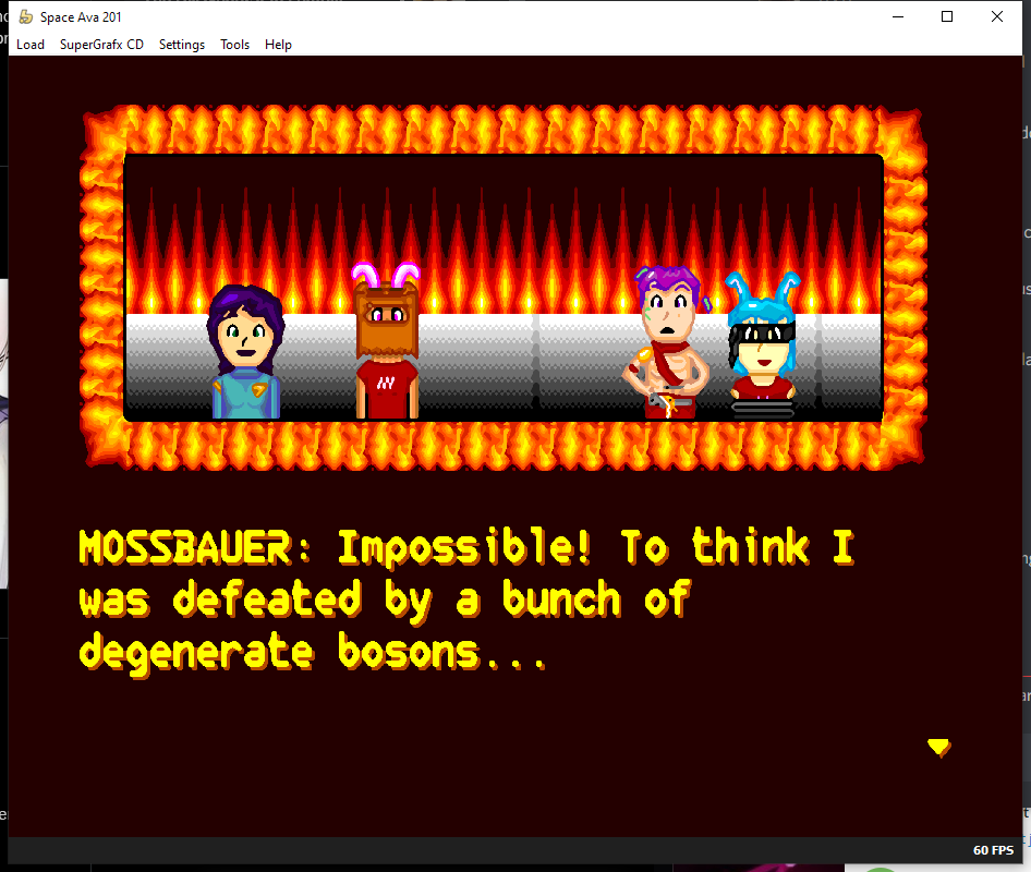
A dialogue scene. This runs in a different graphics mode, and the one I’ve chosen also has the flames surrounding it, which have a lot of vibrant colors. The wall behind them features light dithering. This scene takes place on the surface of the star Betelgeuse, in case you haven’t played the game and were wondering.
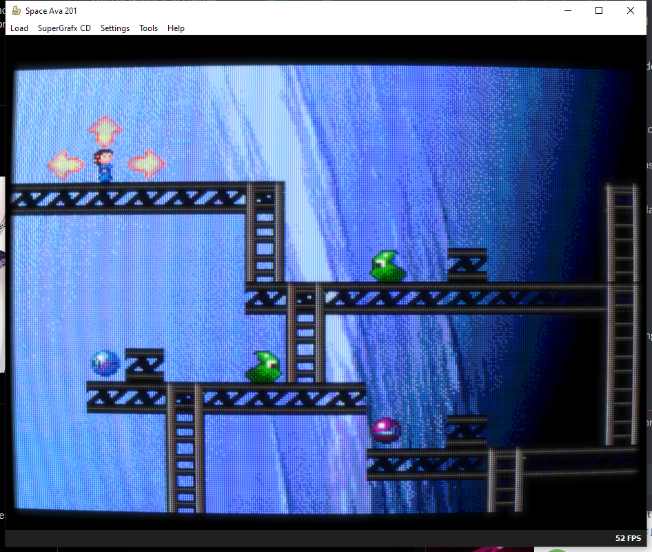
Neptune. This is the SuperGrafx version; on the PC Engine, the background is different. This background does some parallax scrolling when you move, which I’m told is pretty impressive in 1992. The background here is also a digitized photo; Paint Shop Pro was used to cut the background colors into a proper palette and add dots.
The artist’s intent when the artist is Nicole

I drew all the art for Space Ava 201 in a program called “Terraformer”, which is of my own design. I talk about this a bit more in a prior blog post, but the most relevant thing here is the fact that this is where the graphics were made, so if we talk about “intent”, this was where I was looking at them while drawing.
And you might notice some things.
The pixel ratio
All the pixels in the above screenshot are square. You’re probably used to square pixels; your computer you’re reading this on almost certainly uses them.
The PC Engine has three resolutions: 512×239, 336×239, or 256×239. In practice, it’s a little bit more complicated than that, but this is fine for a first-order approximation. But all of these resolutions were displayed on a television with a 4:3 aspect ratio. But none of those resolutions are 4:3! They’re all squished to fit the aspect ratio of your television. Pixels in the 256×239 mode are wider than they are tall; pixels in the other modes are narrower than they are tall.
Terraformer doesn’t take this into account. But the emulators I used for local testing did; so I always jumping between them. For example, let’s take the emulated screenshot of the dialogue scene above, and squish it down to 4:3. When drawing Ava for Space Ava 201, I made her head wider than in the original Space Ava, because I knew it would be shrunk. Terraformer therefore isn’t actually a great guide to my “intent”.

A fun tool for playing with sampling is the RetroTINK-5X, which I recently paired off with the Pioneer LaserActive. A high-end upscaler designed with retro gaming in mind, it has special modes that do a pixel-perfect upscaling, as long as you let it know what system you’re using. This lets you get a picture that looks like it could’ve come from an emulator. (It does preserve the aspect ratio, but only insofar as it can integer scale)

However, I don’t recommend you use this mode with Space Ava 201. Because as the menu says, this is for 256-pixel wide modes. While this covers most PC Engine games, it doesn’t cover all of them. Let’s look at our dialogue screen.
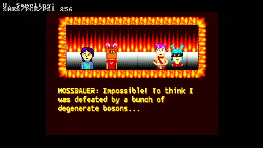
As you can see, it looks awful here. That’s because this uses that 336-pixel-wide mode; unless you want to constantly switch between modes, you might as well just stick with “Generic 4:3”.
![]()
One benefit of this mode, though, is that it lets you use an LCD “scanline” filter which wraps a box around each pixel. Without letting it know you’re using a 256-wide pixel mode, it won’t know where to draw the boxes. This is nice if you want a big-screen TurboExpress experience. And I’m not judging you if that’s what you want, that sounds cool to me.
The palette
The PC Engine has a 9-bit RGB palette. Mostly. Actually, the colors are a little different than that; this startling discovery was made by looking at the game Startling Odyssey 2. But Terraformer’s palette conversion, along with the byuu/higan emulator I used for my testing, use an RGB palette. This is identical to what you’d get with an RGB mod, or a TerraOnion Super SD System 3’s RGB output.
Take a look at this screenshot of Galaxy Fraulein Yuna. Above the diagonal line, you see a screenshot taken over composite video; below over RGB from the aforementioned TerraOnion device. It is quite noticeable in the flesh tones; in general the colors over composite are less saturated. I did do testing using a composite CRT.
The background is almost black, because the darkest shade of red is almost black, and this TV is also not in great shape; could use some overhauling and the tube’s definitely seen better days. It’s actually probably a pretty good match for the sorts of televisions many people played these kinds of games on back in “the day”. When I was making the game this palette issue wasn’t as well documented, but today there are alternate palettes available on emulators, the MiSTer, and even TerraOnion’s Super HD System 3 can apply them on RGB or HDMI output on real hardware.
Clarity
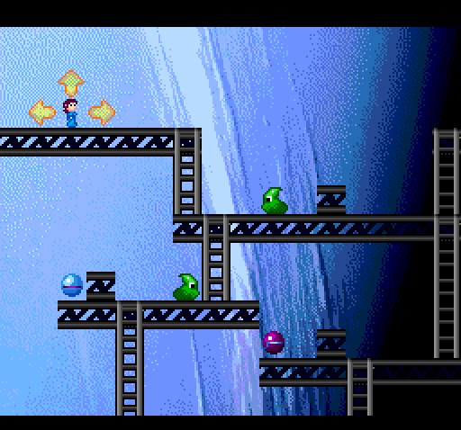
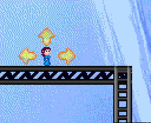
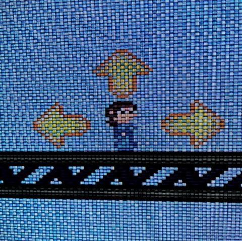
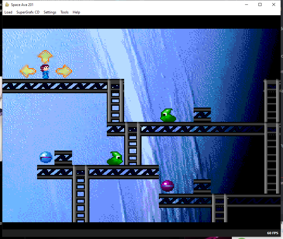
The conversation screenshot doesn’t show much of it, but there is some dithering in Space Ava 201. Take a look at the directional arrows that surround her in the 2D platforming segments.
The PC Engine or even the SuperGrafx, which this mode runs on, can not do true translucency, where one layer is partially transparent. However, it can do this, and sometimes analog video sources are noisy enough to notice. This isn’t a great use of the technique, though; it’s works better in 512-pixel-wide modes, where things definitely get smeared together. (The Super Nintendo has similar modes)

For example, while testing I would frequently use an NTSC composite filter over the game to look at these kinds of “blurring” effects and see how they turned out. Unfortunately, the distortion here brings in line artifacts that kind of ruin the effect, but it actually looks pretty close to how it looks on a real CRT over NTSC composite video. There are line artifacts there too, though they look a bit different on my TV.

One filter that I really like the look of this mode in is “CRT Royale”, which tries to recreate the look of a high quality CRT, like you might find in a broadcast video studio.
The crispness of the lines isn’t lost, but the filters really seem to add some depth. It’s still dithered if you look closely, but the slight amount of “bloom”, imitating a CRT, blends the colors in just enough. I’m assuming a real broadcast video monitor might be able to do the same, but I don’t have one.
Scanlines and the RetroTink-5X
The RetroTink-5X also adds some filters of sorts in the “Scanlines” section. While personally I’m not a huge fan of the typical integer black-bar-of-pixels scanlines, some of these are actually really neat, involving emulating real television geometry. I mentioned the Aperture Grille, imitating a Trinitron, so let’s take a look instead at Slot Mask.
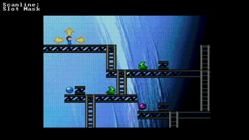
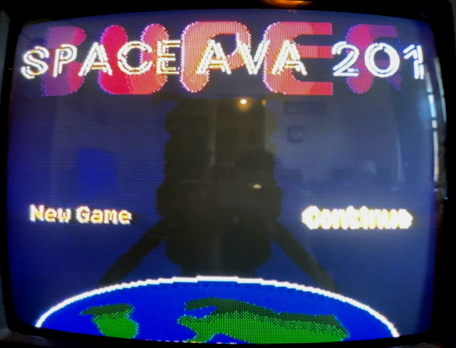
Slot Mask imitates a pattern that was common on nicer CRTs that weren’t from Sony, where the colors weren’t full strips like in the Aperture Grille, but aren’t in a square arrangement or circular dots either. These “slots” were slightly offset from each other. The screenshot is pretty blurry and ruined by compression, so let’s take a look at the photo of the TV.
This as usual would look better in higher resolutions, but the effect at a distance from a television is actually pretty decent; I’d play the game like this. (You could think of it as emulating a monitor with a high “dot pitch”) Of course, I never did during development, since Space Ava 201 predates the RetroTINK-5X.
Filters
The cool thing about the RetroTINK-5X’s scanline filters is that it lets you use them in real time with a real SuperGrafx, with imperceptible impact on lag. But the real wild west of filters is in emulators, running on computers with their own GPUs that can do more advanced processing. I’ve mentioned the “NTSC” and “CRT Royale” filters before; it’s interesting to note that the NTSC filter emulates more accurately a LaserActive, since it doesn’t change the palette but still shows NTSC artifacts; the LaserActive takes the RGB from the PAC and creates a composite signal internally.
I frequently switched out different filters while developing; I really dislike the uneven scaling that integer-scaling could give when trying to keep the 4:3 aspect ratio, so I always felt I needed some sort of filter. It might be blasphemous and it’s definitely not everyone’s cup of tea, but I even enjoyed a smoothing filter now and then.
Though in my opinion the smoothing filter only really looked decent on dialogue sections. In-game it was too eager to just draw diagonal lines everywhere, especially in the Neptune shot. I think these filters only really work on larger graphics.

Another option that had promise was “MDAPT-Dedithering”, a motion-adaptive dedithering. Unfortunately I wasn’t super happy with the result for Space Ava 201, but there are probably games this technique would work well on. It’s a bit “smeary” for my tastes.
It’s possible that as we get newer scalers with beefier processors or FPGAs that some of these more advanced filtering techniques could come to real consoles. For me, that’s an exciting idea.
Video games are silly
So, how do I recommend you play Space Ava 201? On a worn-out composite-only CRT that you can see my living room reflected in? Well, no. Honestly, I’m quite happy with the look of the game on a Generic 4:3-scaled RetroTINK or OSSC picture, in the RGB palette, with crisp pixels and all. But the extra texture that some of the filters can provide is pretty cool, and can also unlock some of that “nostalgia” feeling that everyone is all excited about these days. It’s also cool that devices like the RetroTINK-5X can bring the filters to real hardware; a bit silly if you really think about it, but it is a game after all.
Over all, if you’ll allow me to philosophize a bit, I think this sort of options really shows how video games can be a different experience from other types of art or content; of course no one cares about the monitor you view the Mona Lisa on, and listening to music generally has the ideal of the live band. Even arcade games have the ideal of the machine; but console games and computer games have always been played in varied environments, on varying monitors, with varying controllers. Which is pretty cool, I think, even if it means that the options can become a rabbit hole. Speaking of which, if you don’t mind me, I need to go dig my way out. Wish me luck!
This post originally appeared on Nicole Express, my personal blog. It is reproduced here with permission.