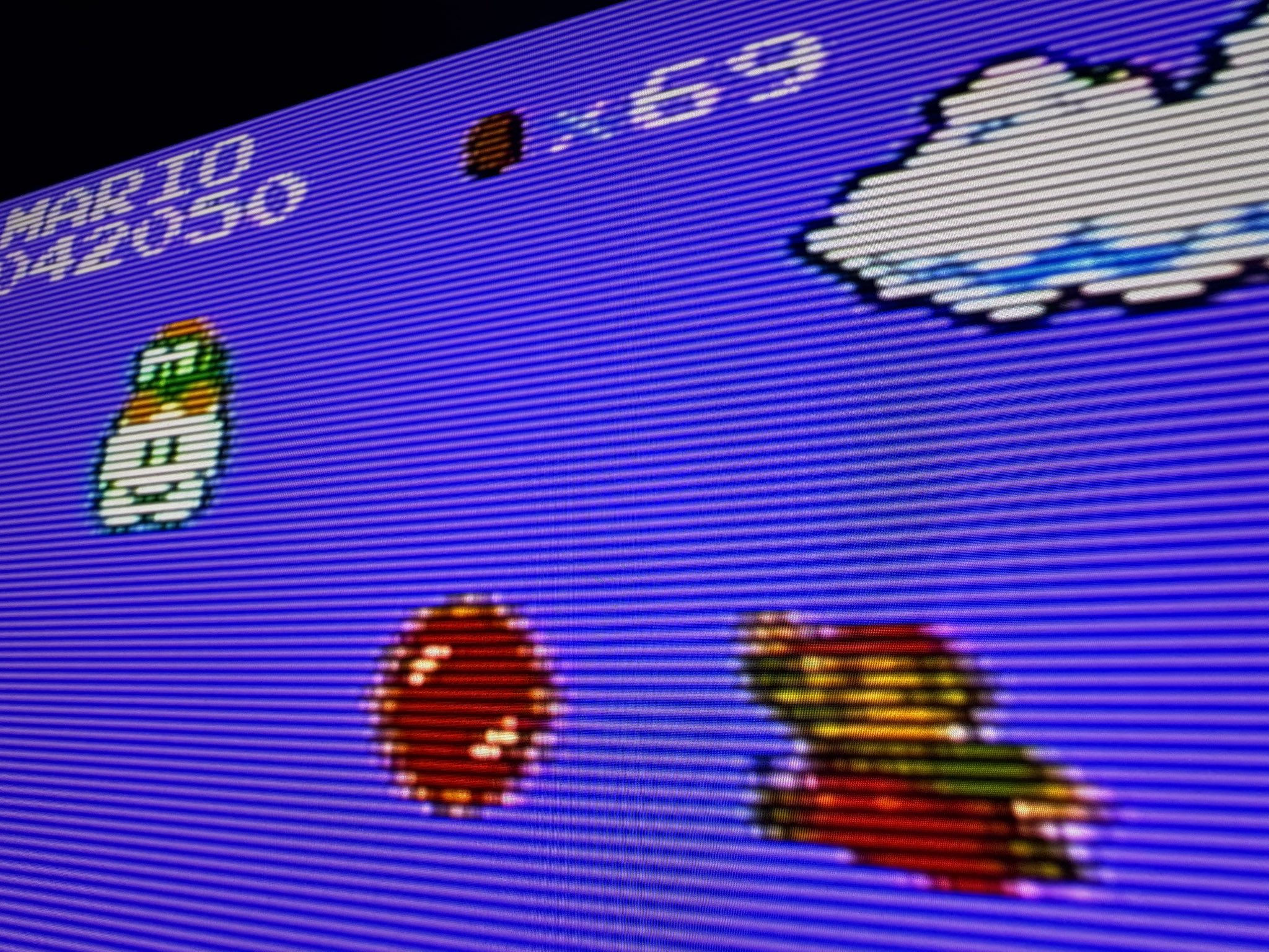
Recently Bob tried out the new RetroTink4K feature announced by Mike Chi where illegal NES colours could be displayed in HDR:
This is a pretty exciting development, and I’d like to take you through some of the technical reasons why. Before I start, however, there’s two points I need to emphasise.
The first is that when people talk about the variability of the NES palette, while it’s fairly well understood that the problem exists, it’s quite often misunderstood why. Frequently cited is the old joke that NTSC stands for “Never Twice Same Colour”. And yes, while NTSC had its challenges specifically due to how it encoded colour and how easy it was for signal interference to affect that, this is not what we’ll be focusing on here. In fact, throughout this document I’ll show you a couple of tools you can use to simulate that problem, and you can see how small those impacts are for yourself compared to what the RetroTink4K aims to cover.
The second point is what “HDR” refers to in the modern display world. The initialism itself stands for “High Dynamic Range”, and the general understanding is that this refers to “nits”, or brightness levels alone. And while that’s certainly the strict definition of the term, in the consumer display space it also brings with it new colour standards as well. Most phones sold today ship with screens that use a wider colour gamut called Display-P3 (often incorrectly called “DCI-P3”, which actually has a completely different white point due to the slightly greener bulbs used in the first generation of Digital Cinema, which is what the “DC” in “DCI” stands for). Most 4K televisions sold today support the ITU-R BT.2020 colourspace, including wider colour gamut. The latter also typically supports an EOTF (Electro-Optical Transfer Function) called PQ (Perceptual Quantizer), the latter of which is the specification that allows for a much larger range of brightness than previous SDR standards found in computers and televisions over the last 40 years.
All of this can sound a bit daunting at first, but I think one of the better ways to understand it all is to visualise what this means. I covered some of this a while back in a post here on RetroRGB where I wrote about colour differences between CRTs and other displays around the world, which included differences in white points as well as the very definition of what “red”, “green” and “blue” even mean, how we define them, and how they can be completely different between technology types and even brands of displays:
Using our classic CIE “horseshoe” colour diagram (which shows all of the colour range humans can see), let’s look at two standards side by side. For simplicity, we’re going to stick to the current popular television standards of BT.709 for SDR, and BT.2020 for HDR. (When the NES debuted in 1985, standards like SMPTE-C and BT.601 were more common for SDR, however these are extremely similar to BT.709, so let’s simplify things for the sake of explanation. Likewise, we’re going to ignore Standard Illuminant C vs D65 vs D93 white point differences for now, and just keep everything simple).
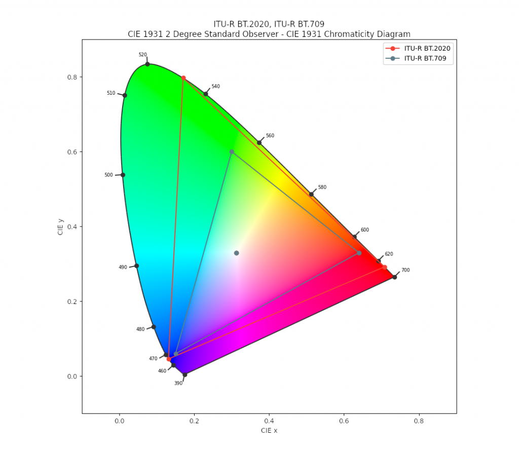
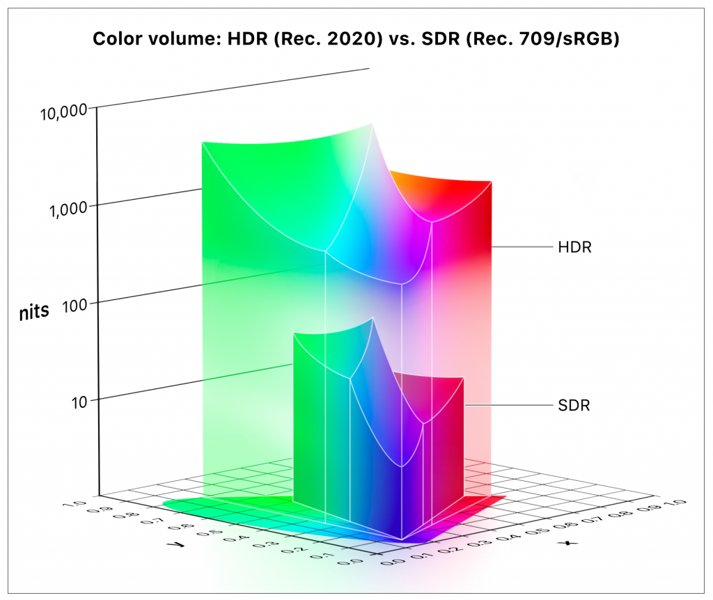
What we see here is a 2D representation of the “gamut” of each colourspace. BT.2020 covers a lot more area, and what that means in the real world is that BT.2020 can display colours that BT.709 just can’t achieve. Often you’ll hear people talk about the “pop” that HDR displays can bring to colour, and what they’re actually talking about is the WCG (Wide Colour Gamut), or more saturated colours than SDR can show. However this only covers a portion of what’s going on. As mentioned above, these standards also talk about brightness. To demonstrate that, let’s take our horseshoe shape above and lie it flat on the ground. From here, we’ll project upwards to represent colours from their darkest at the bottom, to their lightest at the top. We’ll turn our 2D colour “gamut” into a 3D colour “volume”.
To see this, we’re going to borrow an image out of Apple’s “HDR and Wide Color Gamut for Final Cut Pro” guide:
Some things to take note of:
Firstly, the scale on the left is logarithmic – while the spacings look even, the “nits” (cd/m², or “candelas per square meter” – a unit of brightness with respect to surface area) scale jumps from 10 to 100, 1000, and then 10,000, to compensate for the true height of what this chart would be. Contrary to popular belief, SDR doesn’t define a hard value for peak brightness. While people often claim that it goes from zero to 100 nits, the standard actually allows for higher values (to compensate for bright viewing environments). Instead the standards make the case for relative differences across a 100 point scale. But certainly for the CRT era, displays often struggled to get any higher than 150 nits even towards the very end of commercial CRT availability (with standards like sRGB aiming for 80 nits to both relieve eye strain of office workers staring at very boring and very white spreadsheets all day, as well as improving the commercial life of CRTs, all long before we got sensible and used dark mode). Regardless, with the scale that the HDR spec can achieve, we can stick with the “100 nit” assumption for CRT-era displays.
With that in mind, we can see how the full volume of “HDR” (BT.2020 with PQ EOTF) is incredible. Looking only at the 2D gamut range makes it appear like we’re talking about roughly twice the colour. However in 3D, taking the scale on the left into account, we can see the range is ENORMOUS.
Secondly, we notice that our primary colours of red, green, and blue have different peaks. This is largely down to how the human eye perceives brightness. While we have three “cones” in our eyes for discerning colour, the “rods” are what tell us how bright something is. However those rods happen to be stimulated mostly by a shade close to green (with a slight lean towards blue). As a result, pure blues and reds for the same number of photons look “darker” to us. We can see this clearly in the 3D shape above, where our matching colour volumes are weakest for pure blue.
BUT DAN, WHAT THE HECK DOES THIS HAVE TO DO WITH THE NES, AND WHY DID YOU CALL IT “NAUGHTY”.
I’m glad you asked. The Nintendo NES is indeed very naughty. One of the trickiest things about the NES is that it doesn’t define colours in RGB like many other consoles (which then use other chips on board to convert those colours into TV-compatible colours, and then finally add in sync and other things to spit out a full video signal). The NES doesn’t even just generate SD TV era colour models like YIQ or YUV either. It goes even further to generate the entire NTSC composite video signal inside its PPU (Picture Processing Unit). You can read much more about this in detail on the NESDev Wiki, and why interference from other components inside the NES as well as the voltage decay issues of the NES chips all alter that signal and cause problems. However as mentioned above, this “Never Twice Same Colour” problem is not what we’re focusing on in this article.
When we define how colours are represented when encoded and transmitted as voltages, we set agreed upper and lower limits on what these can look like. Voltages inside this range are “legal”, and outside of this range are “illegal”.
To see some of these voltages and their resulting colours, let’s look at a fun little tool called Pally. Pally allows us to do some really neat stuff. You can simulate many of the NTSC problems I mention above, but we’re going to look at something else. Let’s ask Pally to assume a very simple decode of the NES signals, without compensating for or simulating any of the real world things that impact the final colour decode that various TV brands would do. In doing so, Pally spits out an image like this showing the signal decoding of NES colour $22 (the sky in Super Mario Bros) is doing:
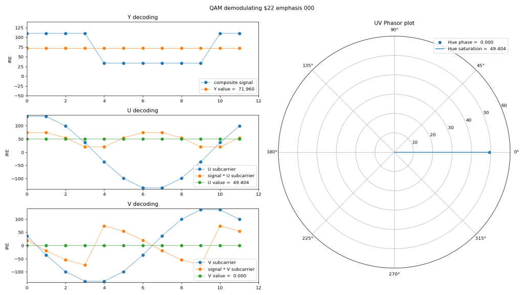
Look at that co-ordinate system on a YUV scale, and you can see it lands roughly on that classic blue-ish/purple-ish colour that has caused endless Internet arguments over the years.
Pally’s main goal is to create usable NES palettes. Here’s what that can look like, depending on the arguments you feed it to simulate various encode and decode characteristics of different NES revisions and TVs, various colourspaces, phase distortions and skews, etc:
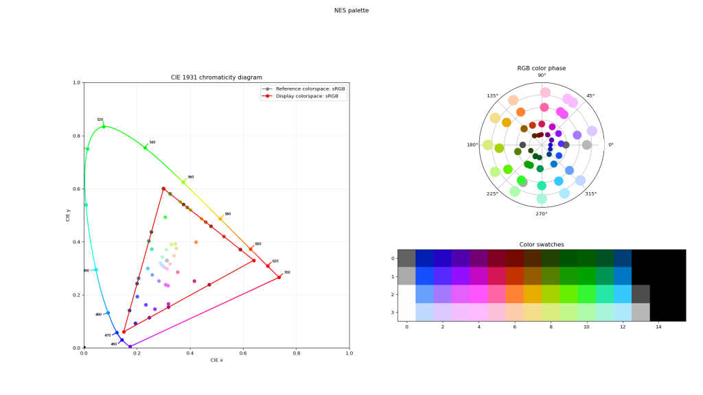
Take particular note of the colour chart on the lower-right of that output. Go to position 2-2 on the graph (i.e.: our favourite Mario sky colour $22), and point it at an RGB colour picker in your favourite image editor. When we do, we get the R,G,B triplet: 166, 121, 255:
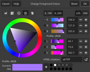
One thing to remember is that referring to colours in this way isn’t absolute. The 8-bit scale of 0-255 is simply an easy way for computers to refer to a range (and that range is relative to where we define our primary colours and range limits). If we instead talk about these numbers as a percentage relative to some lower and upper limits, they would be 65.1, 47.5, 100. In floating point maths, we’d use a scale from zero to one, or 0.651, 0.475, 1.000.
What’s immediately odd about this triplet is that one of the values is 100% (or 1.000). Anyone with a background in imagery or photography (or audio or any signal processing, really) would immediately be suspicious of this value, as it feels like it could be “clipping” – i.e.: where the real value reaches some much higher number, but has been cut back by the limits of this particular digital representation.
Let’s dig into Pally some more. Like all great software, Pally is open source, so I can peer inside and tell it to print the values it calculates before they are clipped. When I do so, I get the following for colour $22:
[ 0.65228426 0.47555416 1.56228928 ]
And our suspicions are validated – the blue channel is decoded to a whopping 156%! But how do we represent that? In our 8-bit RGB world, the triplet above would be 166, 121, 398. And there’s no such thing as “398” on a scale that can only go from 0-255.
What we see here is the actual problem with the Very Naughty NES. While NTSC has its challenges specific to colour, the NES generates a full video signal internally (not just colour data, but everything mashed together) at voltages far in excess of legal levels. In our safe and comfortable digital world, we simply clip these back. But what happened in the analogue world when these signals are fed into real world displays?
Well, that depends on a lot of things. Some analogue decoder circuits inside TVs clipped. Some scaled in odd or non-linear ways. Some let the over-voltage information pass through, but then would probably have been scaled back by the limits of the CRT electron gun. And even if an over-excited electron gun struck that poor, delicate blue phosphor coating on the CRT screen, it would have illuminated only as far as it could go beyond what was expected. In short, we really don’t know, outside of actually using a colorimeter and measuring real CRT screens, like I did some time back:
But here in 2025, we now have some interesting options. Cast your mind back to our SDR vs HDR colour volume chart above. With HDR we have loads and loads of headroom over and above the limits of SDR. We can take that “156% blue” level, and just let HDR plot it way outside of the SDR range. All we need is a device that can decode the signals coming out of a real Nintendo NES and translate them not into the limited BT.709+BT.1886 we’re used to, but into full BT.2020+PQ, which is precisely what the RetroTink4K can do.
The NES has a palette of 52 colours, although some of them unusable because they are too low voltage (yes, the NES is very naughty in both upper and lower levels). Looking at the output from Pally:
- 17 colours go over 100%
- 10 colours go over 110%
- 5 colours go over 120%
And our Mario sky favourite $22 is the winner, with the single highest overdriven value.
Unsurprisingly, blue is overdriven the most frequently – this makes sense when you look at the colour volume charts above. Pure blue has the lowest height on the chart, followed by pure red and then pure green. This pattern matches with the primary colours most frequently overdriven by the NES (in fact, green never over-drives at all).
To try and preview of what this might look like, I used a combination of open source tools to create some YouTube videos. These use Pally to generate the NES palette values in clipped SDR and unclipped WCG/HDR modes, Colour Science for Python to do the correct colour math and EOTF calculations, OpenImageIO to create the WCG/HDR frames, png_cicp_editor to correctly tag the third generation PNG files I produced with the correct colourspace/EOTF, and finally ffmpeg to render out the resulting videos. (I’ll attempt to put the scripts and workflow up on GitHub soon). I’ve used the ITU-R BT.2408 recommendation of 203 nits as reference white (aka SDR’s white point, sometimes referred to as “paper white”). Values that go over this shouldn’t go any further than about 300 nits peak, and should be viewable even on lower quality HDR-400 displays (although better displays are always recommended).
To view these videos properly, you MUST have a combination of a YouTube player app that can play HDR content, as well as a screen that is HDR. For best results, use the YouTube app on a recent phone with the brightness turned all the way up, or a recent 4K HDR TV with the native YouTube app. Also ensure you go to the video quality setting and select “2160p HDR”. If you don’t see the “HDR” part on the 2160p setting, your combination of software and hardware cannot view HDR content.
Watching on either software or hardware that is limited to SDR will tonemap the values, and the differences will be subtler again, and incorrect. Some combinations of PC based web browers, operating systems and screens can play HDR, although support is hit and miss. Sadly the desktop PC world has fallen very far behind in HDR adoption compared to the video world, and commercial OS and browser developers seem strangely terrified of improving the situation. But I digress…
Here’s a simulation of the full NES palette. To find colour $22, start at the bottom left of the palette, and it is three blocks over and two blocks up:
And here’s a simulation of just palette colour $22, the Super Mario Bros sky. The colour is full-field, and depending on your screen may show off whether or not your display’s ABL (Automatic Brightness Limiter) will affect the output. Keep an eye on the SDR side of the image as it flicks from full-SDR to half-SDR/half-HDR. If you notice the SDR side darken, that can indicate that ABL is altering the image:
The Super Mario Bros sky colour appears far bluer, as we predicted above. And again in this case, not because of NTSC transmission or colour decode problems (although they do also impact resulting colours as well, we’re just ignoring them for the sake of simplicity in this article), but actually because the Nintendo NES’s video signal voltage is beyond the limits of broadcast standards.
While subtle, the differences are interesting. HDR’s extra headroom over digital SDR limits means we can experiment quite a bit more with unusual consoles like the Nintendo NES that did a poor job of conforming to broadcast TV limits of the era. A huge thanks as always to Mike Chi and Extrems for the extensive colour and HDR work that they have put into the RetroTink4K family of scalers, which allows us to try out these interesting ideas.